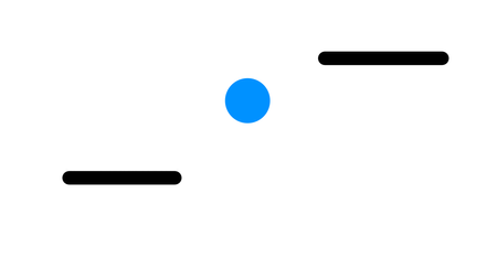
Click the thumbnail to try out our game
My role for this project was to be the lead artist of my group. With the help of the rest of the team, we were able to produce assets that we felt depicted our game's vision to the best of our ability. We wanted a cyberpunk theme for our game featuring a ninja in that same aesthetic. With that in mind I set out to do some research on the cyberpunk theme and tried to incorporate my findings into the design.
Creating a ninja

Starting off with the ninja character, I sought out similar pieces of artwork of cyberpunk themed characters and compared them to traditional ninja attire and artistic renditions from all different types of media. What I found was that I wanted to keep the "aloofness" of the ninja persona and then apply our desired style. I started with designing metallic coverings similar to pieces of armor placed on the characters chest, forearms and shins and mask covering the face. I decided to cloak the character with a flowing jacket as well to capture the free form movements of ninjas typically featured across tv and games. Additionally the flowing jacket was made to mimic the wind.

A red variant of the ninja character was also in the works to account for the "phaseshifting" mechanic. When the player character phaseshifts, the ninja, switches between red and blue according to the incoming colored obstacle. Finding the right red hue for the character proved to be a bit of a challenge because I needed to match the tint of the red to the tint of the original blue. Through trial and error, I took notes of of the different RGB values and jumped back and forth between dulled and saturated reds. Eventually, I came to a conclusion that I felt matched the original very well.

Our sidescrolling game also featured platforming gameplay so several more spites that could effectively and accurately depict a jump were created. Thanks to my experience in 2D animation, I knew to sketch all of the frames needed to make the jump cycle and then to outline my drawings; coloring followed soon after. The biggest challenge of these cycles was to keep my drawings consistent in size with each other and with the standard running cycle. It required me to adjust and resize and compare all the drawings in photoshop until I was satisfied.

Over coming hurdles


Character art is what I am best at, and landscapes and interior art is unfortunately not my forte but I was determined to see this through for my team and to better my skills. I searched for references showing cityscapes and skylines as well as decrepit and abandoned buildings. I went through different versions of each piece, working meticulously on getting the colors and the composition right. Looking back at this now, I feel that I was able to show what we wanted for the players as best as I could. If I were to go back to this now, I would look into exploring ways to add more detail as well as different styles of environment design.


Architectural design is also another obstacle that I had to overcome. The first I did was to look for reference, but my biggest problem was finding an appropriate art style. So, I began looking at cyberpunk artwork again, searching for anything that piqued my interest. I saw that neon colors where used as accents very often across different media. I immediately thought of the movie Bladerunner as well as the sequel. I looked at trailers and movie clips scanning for the different structures hoping to capture that esscense into my work. Megaman X also came to mind. I googled images of the first level and took inspiration from the cityscape background and the different buildings zooming by.
Leveling our design
When it came to designing our level, We took a simpler approach. Using simple shapes and solid colors, we mapped out what the layout would look like. Despite the game being a auto-runner with procedurally generated platforms and obstacles, this gave us a good idea of the kind of level the player could find themselves in.
The blue and red circle represented the player and which state that they were in. Since the main gimmick of our game was that the player character could shift into different states in accordance to the obstacle coming their way. so whenever a blue or red barrier(the vertical blue and red lines) come in the players way, they would need to shift to the barriers color to pass through.
The black circle on the other hand represented incoming threats that the player would have to dodge regardless of what state they were in. In addition to this, the black horizontal lines symbolized platforms or areas that the player could run on.


